color theory

Some basic terms:
• hue, value, saturation/chroma
• primary, secondary, and tertiary colors
• analogous and complementary colors
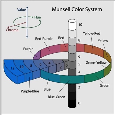
Every color has three "dimensions." Hue is what we usually name as the color itself: blue, orange, etc. Saturation (a.k.a. chroma) describes how intense that color is: a bright, fluorescent orange or a dull, rusty orange. Value describes how light or dark the color is: a light blue or a dark blue.
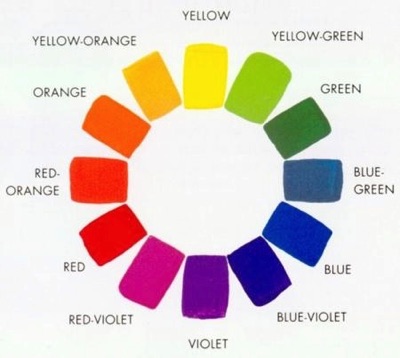
Above are the hues of the spectrum laid out as a color wheel, consisting of three primary colors (red, yellow, and blue); three secondary colors made by mixing primaries (orange, green, and violet); and six tertiary colors made by mixing a primary with an adjacent secondary.
Applying color theory to color practice
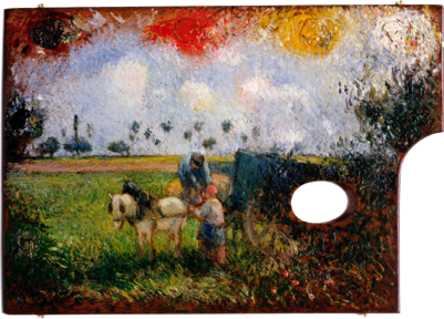
When painters try to match the colors you see in nature, they start with a limited range of basic hues on their palette. Below, Camille Pissarro creates a landscape on his palette using just five colors plus white: (clockwise from lower left) green, blue, a violet-red, an orange-red, and yellow.
Artists’ pigments were traditionally made of ground-up animal, vegetable, or mineral matter. For example, raw umber was made out of a colored clay found in the Umbria region of Italy; burnt umber was the same clay baked in order to change its color slightly; cochineal red was made by crushing certain South American insects; ultramarine blue was made out of powdered lapis lazuli gems, and so forth.
Two big problems with matching nature’s colors in a painting are these:
(1) There are very few saturated (high chroma) colors in nature that you can grind up into powder. There are even fewer that won't fade or change over time. Plus most high-chroma, non-fugitive pigments were wildly expensive. By far the cheapest and most plentiful pigments are the relatively dull, muddy earth colors such as umber, siena, and ochre, but these make dull, muddy paintings that are far from the intensity of color in nature.
(2) Even if you start with high-chroma pigments on your palette, whenever you mix two pigments together the result is always less saturated than the two you started with. The farther apart the two colors are on the color wheel, the duller the mixture of those colors will be. Thus while mixing two adjacent or analogous colors like red and orange will give you a relatively high-chroma mixture, mixing two opposite or complementary colors like blue and orange or red and green will result in a dull brown or gray.
Traditional Academic painters used mostly dull earth colors, but the Impressionists tended to paint with as close as they could to pure primaries, secondaries, and tertiaries, and to avoid mixing colors as much as possible (except with white) in order to retain the highest degree of saturation that they could. If you walk through a museum collection chronologically from the Renaissance on, one of the most dramatic changes you will see is the sudden jump in the saturation or chroma of paintings starting in the late-nineteenth century.
In this the Impressionists were greatly helped by the new science and technology that was applied to color as to most other fields in the nineteenth century. With the exception of vermillion (which dates from the Middle Ages), the most saturated pigments in the 1891 color sampler above from Lefranc & Co. are brand-new synthetic substitutes for expensive and fugitive natural pigments: cobalt blue (invented 1802); French ultramarine (1826), emerald green (1814), cadmium yellow light (1840), and madder lake (1806). Four out of the five colors used by Pissarro in his demo above are new synthetics: emerald green (1814), French ultramarine (1826), alizarin crimson (1868), and chrome yellow (1820). Such synthetic pigments were closer to ‘pure’ primaries, secondaries, and tertiaries; and allowed the mixtures of these pigments to remain fairly high in chroma. It's still impossible for paint smeared on canvas to dazzle you and make you squint the way the light out-of-doors can do, but it became much more plausible for a painting to do so in the late-nineteenth century.
In addition to using the new synthetic pigments, the Impressionists also took advantage of another trick discovered in the nineteenth century. Although mixing complementary colors gives you a very dull, low-chroma color, when you put complementary colors (such as red and green or yellow and violet) next to one another, they intensify one another, looking even more saturated than they do on their own. Look out for intentional juxtapositions of especially orange and blue, and red and green, in Impressionist paintings.